Mobile & Desktop Sizes
Optimize your menu design by setting different sizes for mobile and desktop, ensuring a seamless experience across all devices.
Overview
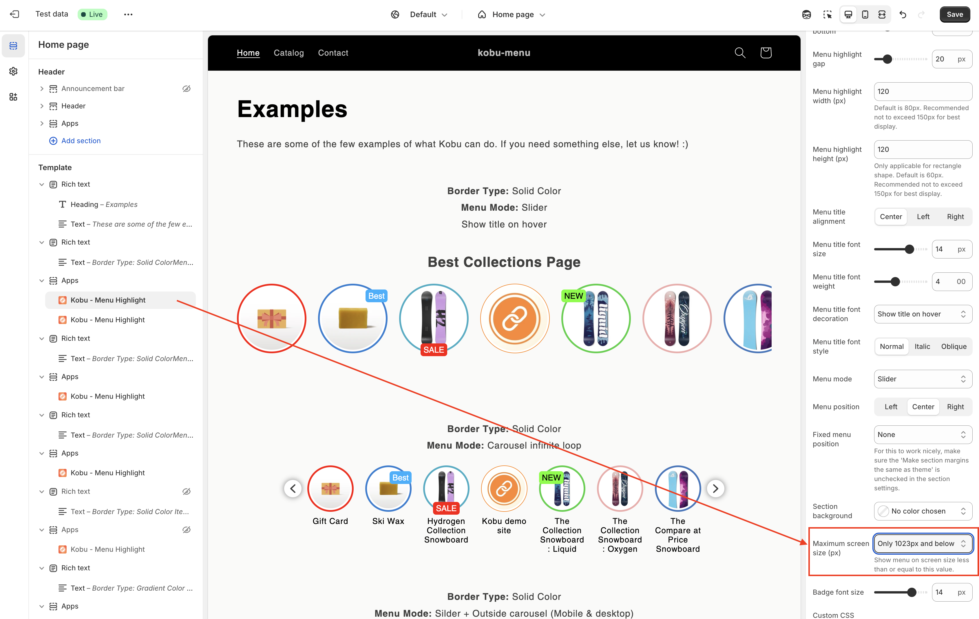
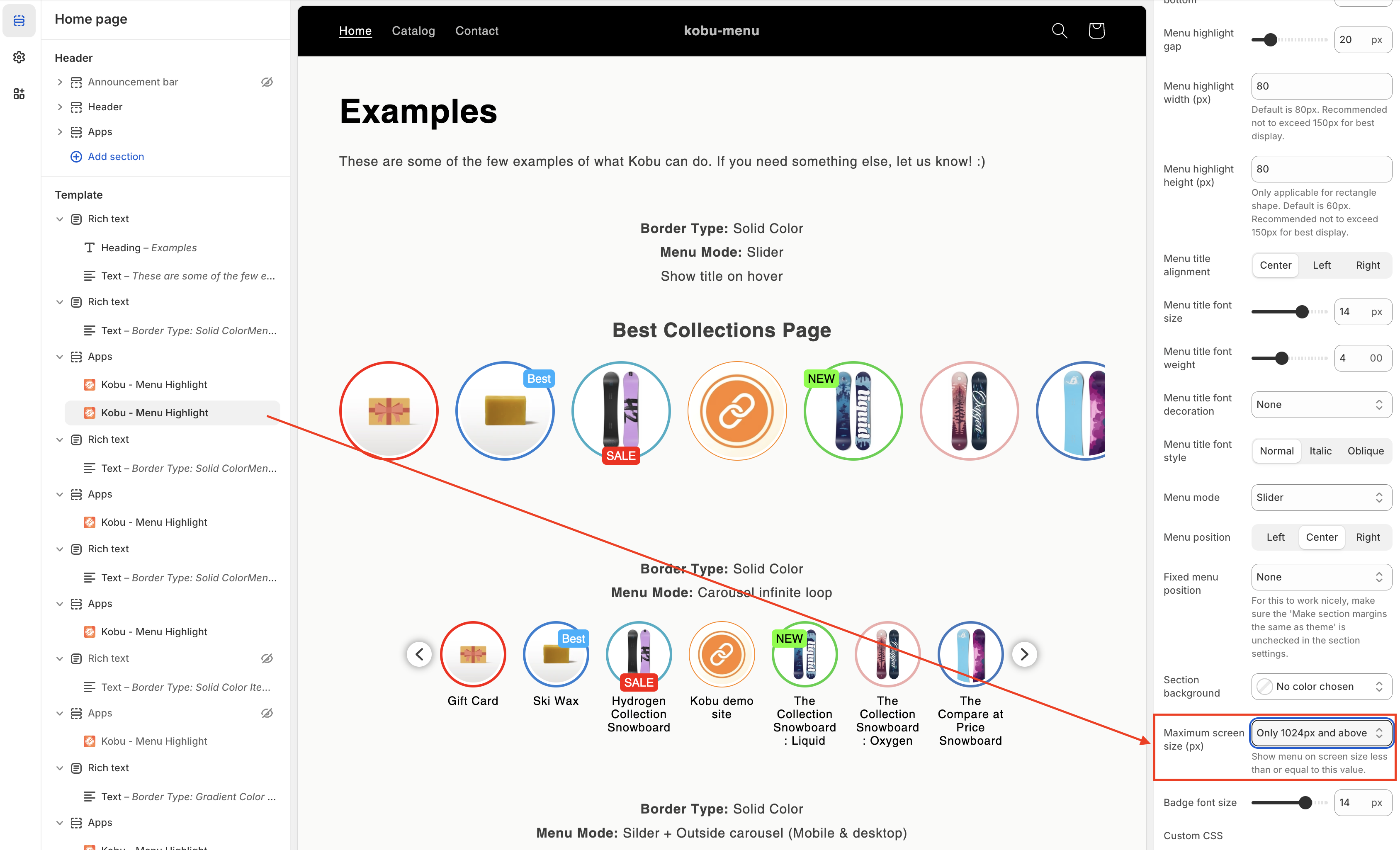
To configure different menu sizes across devices, use two separate Kobu - Menu Highlight theme app extensions with distinct screen size settings.
Configuration
First Extension (Mobile & Tablet)
Set the "Maximum screen size (px)" parameter to "Only 1023px and below" to display this configuration exclusively on tablet and mobile devices.
Second Extension (Desktop)
Set the "Maximum screen size (px)" parameter to "Only 1024px and above" to display this configuration exclusively on desktop viewports.
Result
This configuration allows separate menu designs for mobile and desktop devices.