Visual menu badges for Shopify stores
Make important collections, sale links, launches, and guided paths easier for shoppers to notice.
Quick answer
Visual menu badges help when the storefront navigation is technically correct but shoppers still miss important paths. A badge, highlighted menu item, mobile navigation bar, or guided visual block can point attention toward sale collections, new arrivals, seasonal campaigns, product quizzes, and high-value categories. KOBU is the Activory app built for this workflow, with visual menus, badges, mobile and desktop sizing controls, collection-specific menus, and Shopify Markets translations.
When it helps
Navigation has too many equal choices
Badges and visual highlights help shoppers spot new, sale, best seller, or seasonal paths faster.
Mobile shoppers need shortcuts
A mobile navigation bar can keep key categories visible without making shoppers reopen the main menu.
Collections need different guidance
Collection-specific menus can show the most relevant links, promotions, or product paths on each page.
A quiz-like path would reduce choice overload
Guided visual flows can help shoppers choose a category or product path before they browse every option.
Menu ideas
- Sale, new, limited, preorder, or best seller badges.
- Visual menu blocks for seasonal collections.
- Mobile bottom navigation for top categories.
- Collection-specific menus that change by page.
- Product quiz-like flows that guide shoppers toward a product group.
Planning checklist
Start with one navigation problem. Maybe shoppers miss the sale collection. Maybe mobile visitors need faster access to best sellers. Maybe a large catalog needs a guided path before shoppers choose a category. Visual menu badges work best when they point attention to a real decision, not when every link receives a decoration.
Choose the label carefully. A short badge like "New", "Sale", "Gift", "Popular", or "Limited" is usually easier to scan than a full sentence. For collection tiles or visual menu blocks, use plain category language that matches the shopper's mental model. If the store sells gifts, the menu might guide by recipient, occasion, price range, or product type. If the store sells technical products, the menu might guide by model, use case, or compatibility.
Plan separate mobile and desktop behavior. Desktop menus often have more room for labels and visual blocks. Mobile navigation needs stronger restraint because each item competes with the screen, cart, search, and theme controls. The best mobile menu addition is usually the one shoppers can understand in one glance.
Common mistakes
The most common mistake is highlighting too many links at once. If every link is marked as important, no link feels important. Another mistake is using badge language that does not match the landing page. A "Sale" badge should lead to products with clear sale context, and a "New" badge should not remain on a collection long after the launch has passed.
Avoid adding visual navigation without checking translations and markets. If a store sells internationally, labels need to make sense for the active language and region. Also avoid placing a mobile navigation bar where it blocks cookie banners, chat buttons, checkout controls, or theme elements that shoppers need.
Screenshot example
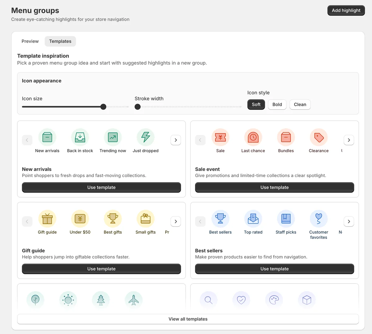
This app preview shows KOBU's menu group templates and icon controls, so merchants can start from proven highlights such as new arrivals, sale events, gift guides, and best sellers.
KOBU fit
KOBU is the best fit when the storefront needs better visual guidance, not another product grid. Use it for menu highlights, navigation badges, visual collection paths, mobile navigation, translations, and guided product discovery.
FAQ
Should I add badges to every important menu item?
No. Use badges sparingly. One or two highlighted paths are easier to notice than a menu where every item is decorated.
Are visual menu badges only for sales?
No. They can highlight new arrivals, seasonal categories, gift guides, product quiz paths, best sellers, preorder collections, or high-value categories.
What should I check on mobile?
Check spacing, tap targets, translation length, and whether the menu overlaps cart, search, chat, or checkout-related controls.
Guide shoppers toward the right path
Use KOBU when important products, collections, or campaigns need more visual attention in your storefront navigation.